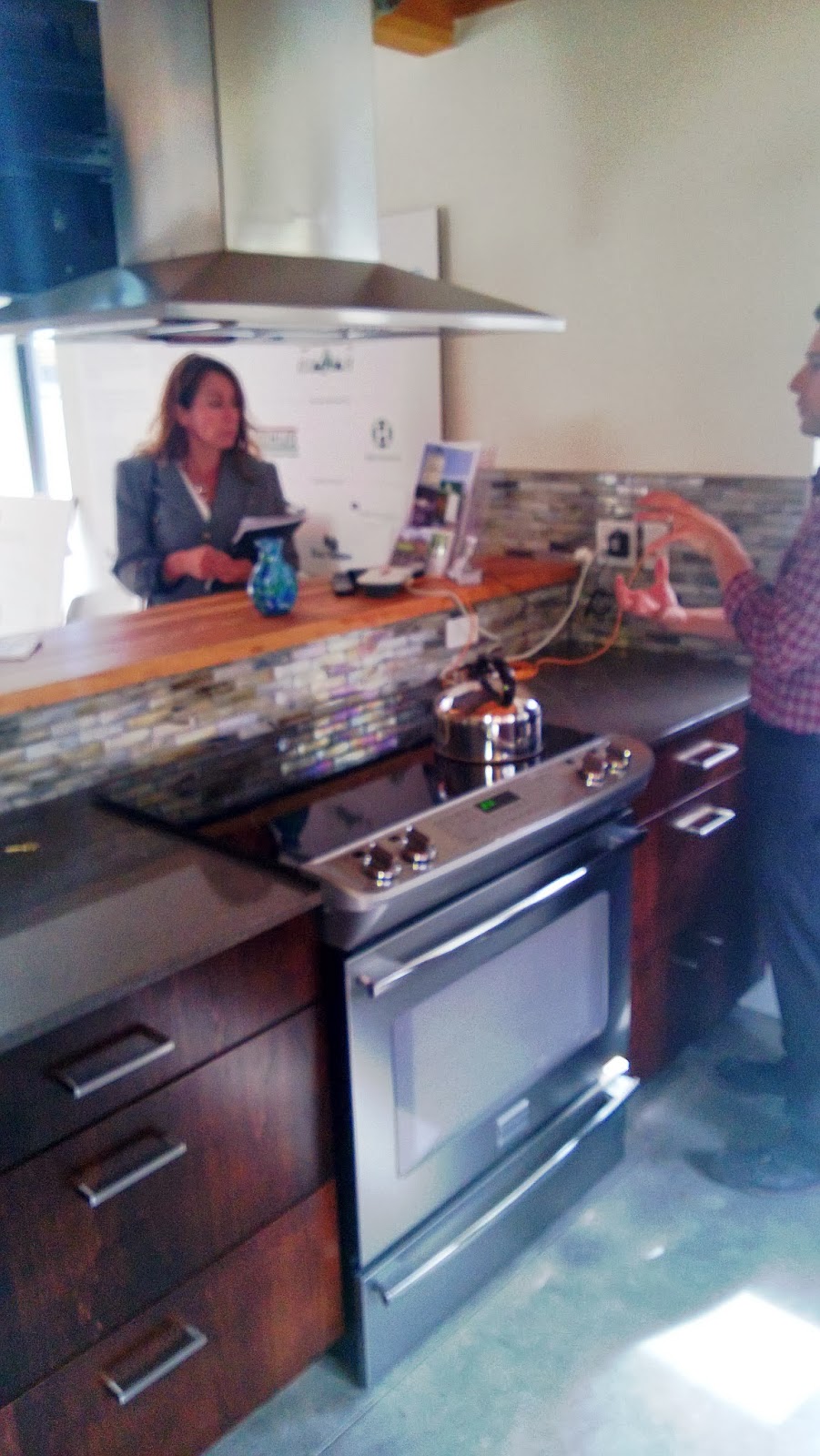
Over thanksgiving break when I was at home in the greater Seattle area I visited a designer by the name of Alyse who works for Build Urban in Seattle with two of my classmates. While meeting with her we presented our final projects for our interior design studio. The presentation took place at a quaint little coffee shop across from her place of work.
We presented our drawings and our designs for a commercial space turned residential apartment that is accessible for a person disabled in a wheelchair for the first floor, and visitable on the second floor. I presented last, and had all of my final work on my laptop (I had scanned my work previously and had it saved on there). I originally was nervous going into the situation not knowing what to expect but Alyse gave me great feedback that really put all of my designs into perspective. On my floor plans she pointed out practical things that would work and what would not, because what we put on paper is not how we would interact in the space in real life. She also reminded us that a few inches here and there would really provide a big difference when experiencing the space as well.
It was very interesting to see what a professional thought of my college project. Alyse's feedback was very helpful and put my work and thoughts into a perspective that I had neglected to see them in before. Overall the visit was beneficial and I appreciated the time Alyse gave to us.

Friday, December 13, 2013
Friday, December 6, 2013
Assignment 4B: Graphic Reflection
Throughout this semester in interior design 205, visual
communication I have learned many useful skills and have improved with each
technique over the course of the semester. This shows throughout my weekly
homework as well as the various assignments that were to be completed. I was
taught how to effectively render with marker while making progress with
sketching a space with depth and accuracy in scale. My improvements in being
able to effectively communicate a space are shown through my weekly journal
entries. The progress in my marker renderings are shown through my weekly
rendering practice, from not being able to effectively layer colored pencils
and markers to being able to successfully communicate the visual appearance of
an object as realistically as I can. Throughout the duration of the semester we
completed a series of three assignments that were to teach us how to correctly
represent the depth of a given space by using 1 and 2-point grids. By learning
this I eventually became confident enough with my understanding of showing an
area accurately to be able to freehand perspectives, but I still have much to
learn. With each assignment I feel that I improved as I continued to practice
the techniques we were taught in class. I personally enjoyed learning how to
render with colored pencils and markers to give the illusion of a realistic
space. I find this vital information for us to learn because the interior
design we are expected to communicate our ideas in the best way possible. Being
a visual person, as most people in the creative field, this is highly
important. In the words of Confucius, “Learning without thought is labor lost,”
and I am excited to keep learning more and giving everything into my future
work to improve my abilities.


Wednesday, October 23, 2013
Habitat Experience

 |
| Putting up one of the exterior walls |

Saturday, October 5, 2013
Sketch Crawl | Seattle Center
After
being let loose in the Seattle Center with free range of field sketching, I
decided to pick the most cliché building to draw—the Space Needle. At first I
tried to build my drawing from the top of the structure, which I quickly
learned to be a bad idea. After that lesson I started from the ground up and I
started to piece the building together in sections, by drawing the contour of
the lines that make up the space needle rather than a failed attempt at trying
to draw the whole thing at once rather than viewing it in pieces. I would say
that defining the components that make up the Space Needle and building my
drawing in a progressive manner was strength of mine during this sketch. I
spent the whole time on it and am actually pleased with the final product,
however the top “saucer” part of the tower is a bit lopsided- but I just took
it how it turned out because not every sketch can be perfect, but I can be conscious
of the issue next time to try to get the contour of the line more accurate to
the actual shape of the slope. I learned that I need to approach seeing the
object that I am drawing as an object, not a whole definable object, but an
object with many layers that can be gradually built off of rather than all
piled on at the same time.

.jpg)
Above is the Space Needle and the right photo is my sketch that I did while at the Seattle Center. The photo to the left is a different view but the same structure.

.jpg)
Above is the Space Needle and the right photo is my sketch that I did while at the Seattle Center. The photo to the left is a different view but the same structure.
Job Shadow | Interior Architects
 |
| Outside Interior Architects' office |
1 My
experience at Interior Architects made me rethink how I want apply myself in
the professional world. Originally I thought that I wanted to go into design
purely residential, but now after my few hours spent at Interior Architects I
am finding myself reevaluating the field in which I want to go into once I
graduate. I was with my classmate Cole and we were first introduced to a
Washington State Interior Design Alumni by the name of Amanda. She was very
helpful when we asked questions about the transition from the college
programming into the real-world working environment by saying that there is a
bit of a learning curve but as long as you apply yourself and do your best you
are likely to succeed. The second person we spoke to was named Tosh. Tosh is
one of the senior designers and he was working with one of his colleagues
trying to figure out how they were going to compromise and collaborate, to come
to a decision on what finishes to choose for a particular client’s space. This
was exciting for me because I got to see a firm working first hand on how they
work as a team to solve design problems and make choices for a real life space.
By getting a taste of how an architectural firm works, I have reevaluated what
field I want to enter when I initially hit the job market after graduation. I
see how the commercial industry has many more opportunities for networking and
can still have fun aspects of design- just like residential, with more of a
professional work atmosphere of a firm is most definitely something I will be
looking into thanks to this experience.


The Frye Museum | Seattle, WA

 |
| My field sketch of a wall feature inside the museum |


The three photos above are the series of features in the entryway leading to the museum


The photo above to the left is a shallow water pool that is a feature of the entryway, it's purpose is to calm viewers down before entering the museum. The photo to the right is a skylight at the entrance of the museum that is to welcome viewers into the museum and give them a transition from the entry to the art.
St. Ignatius Chapel | Seattle University


The photos displayed above are the interior of St. Ignatius chapel

 |
| My Field sketches of the interior and exterior of the building |
 |
| Alternative to stain- glass windows on interior |
Street Bean Espresso & Teen Shelter | Seattle, WA


The photos above are the interior of the Street Bean Espresso space.

Westlake Construction Site | Seattle, WA


The Westlake residence is located in Westlake, Seattle. The first half of the construction site will house the business by the name of, “MadArt”. MadArt’s mission is to support emerging artists in the Seattle community, to bring art into the lives of those in the community in unexpected ways and to create community involvement in the arts. The other half of the building is for residences and studio apartments. The philosophy of the building having half residential and half business, made me realize how to maximize a space to its full capacity. The layout of the residential spaces is beautiful and they made me think of spatial planning differently. All spaces apart from the top floor penthouse apartment are studios. These studio apartments have one level with a kitchen and recreational space and they have stairs leading up to the bedroom space. All of the residencies made me rethink the use of natural lighting and the sizing of windows. Each space has floor to ceiling windows for natural lighting. This made me think of how interaction with humans and their needs to be with nature and the outside is important. This really made me rethink the idea of what a studio apartment means to me and how vast the opportunities for natural lighting in a residential space are.
zHome Visit | Issaquah, WA
On
their website the Z-Homes that are located in the Issaquah Highlands are
described as, “zHome is a revolutionary,
10-unit townhome development that uses smart design and cutting edge
technologies to radically reduce its environmental impacts. zHome will prove
that homes that use zero net energy and 60% less water, emit net zero carbon
emissions, have clean indoor air and use only low-toxicity materials are
possible and scalable to mainstream home production.” By visiting this
particular site and learning about their particular design philosophy I have
grown to be more aware of how to be as energy efficient as possible. When
designing for residential this makes me think of how I can make the home as
comfortable as possible by decreasing the cost of energy, making it easier on
both the environment as well as on the pocket of the client who will be living
there. The most important ideas that I took away from the visit at the z-home
was the wall insulation, and how that contributes a big part to the depleting
energy costs. It made me think of not just the interior
design of the space, but how important the details of the structure that make
that space are to the residents and designers as well. The most important
aspects of human interaction with these spaces are how the residents are
contributing to the energy costs. The natural light and recycled energy that
the solar panels at the top of the units produce are big contributors to this
as well as the humans that are partaking in the consumption of the energy.


 (From left to right: Left- the wall insulation for the z-homes, Middle- stairs leading up to the loft in the home, Right- a section of the kitchen design)


Monday, September 23, 2013
Ride, Don't Walk
There was a recent assignment in class, where we were paired with a partner to do everyday tasks in a wheelchair. The purpose is to put ourselves into the shoes of our client for our semester project where we are designing a residential space for a couple, with the husband in a chair. Through this assignment I came to the realization of how privileged I am to have a set of legs.
.JPG)
.JPG)
.JPG)
You don't realize how everyday tasks are more difficult to perform in a chair. First of all, moving through a commercial space in a chair, not all buildings are 100% ADA accessible. ADA stands for the Americans with Disabilities Act. I found it hard to maneuver myself through hallways, I felt out of control while trying to safely roll down a hill. I also found it difficult to reach on top of counters and wheel myself through doorways. The most astonishing discovery I made was how difficult it was to wheel into a handicap stall of a bathroom. It was frustrating that I could barely make it in the stall without squishing my hands and I found it to be a challenge to turn around to exit the stall as well.
Over all this experience has given me a new appreciation for my independent mobility provided to me through my legs.
.JPG)
.JPG)
.JPG)
You don't realize how everyday tasks are more difficult to perform in a chair. First of all, moving through a commercial space in a chair, not all buildings are 100% ADA accessible. ADA stands for the Americans with Disabilities Act. I found it hard to maneuver myself through hallways, I felt out of control while trying to safely roll down a hill. I also found it difficult to reach on top of counters and wheel myself through doorways. The most astonishing discovery I made was how difficult it was to wheel into a handicap stall of a bathroom. It was frustrating that I could barely make it in the stall without squishing my hands and I found it to be a challenge to turn around to exit the stall as well.
Over all this experience has given me a new appreciation for my independent mobility provided to me through my legs.
Monday, August 26, 2013
Blog Entry One: Home

But when it comes down to it; home to me mainly visual. Visually this is my big bedroom window that sits at the front and center of my house. It is what I identify with home visually when I drive home from every break at Washington State. There are so many memories that I have looking out and into my window.
Tuesday, April 30, 2013
Graphic Reflection Poster

Monday, April 29, 2013
Sketch Journals

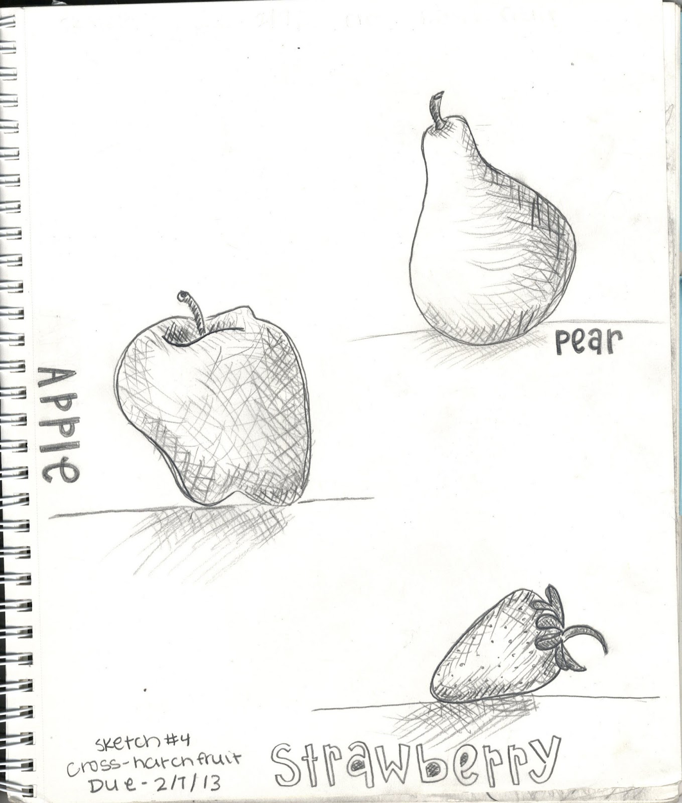
The progression of the notes is prominent through my sketch notes over the semester. I appreciated the earlier ones that concentrated on the basics of drawing and enjoyed how each assignment introduced a new skill. My sketch notes show my strengths and weaknesses. I believe my strengths in sketching are shading and still drawings, and my weaknesses are definitely the 2d and 3d perspectives. My favorite sketch that I did this semester was the fruit/crosshatching sketch- I believe it illustrates my strengths the best.


Tuesday, April 16, 2013
Palouse Sketch

This is my final product of my Palouse Sketch assignment that had to be done on Illustrator software. I have had little background with Illustrator from a class I took in high school for graphic design but I definitely struggled with this. It definitely wasn't the best articulation of the photo on my part and I think that I should have played a lot more with different line weights as well as shading and contours of the actual object rather than the simple outline of everything colored in.
Subscribe to:
Comments (Atom)