Design Philosophy
Design should be used as a tool to better serve environmental surroundings. To create something with both aesthetic appeal and ease of use. The world and how I see it is all the inspiration I need. While in a new environment I find myself analyzing my surroundings finding and criticizing what could be changed about the space and what works. I hope to be apart of a successful design firm and eventually open my own practice some day.
Tuesday, April 30, 2013
Graphic Reflection Poster
For the final in one of my interior design courses this semester was a reflection poster of some of our works that we completed over the duration of the class. I appreciate the aesthetic approach at which I came at this project but I wish I would have played around with the colors of fonts and formatting a little more. Maybe I would have changed the orientation of the poster too, but in the end I am pleased with the final product.
Monday, April 29, 2013
Sketch Journals

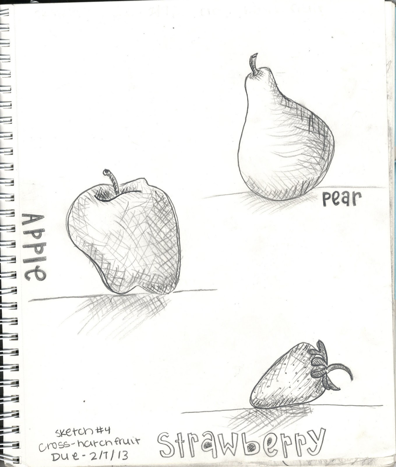
The progression of the notes is prominent through my sketch notes over the semester. I appreciated the earlier ones that concentrated on the basics of drawing and enjoyed how each assignment introduced a new skill. My sketch notes show my strengths and weaknesses. I believe my strengths in sketching are shading and still drawings, and my weaknesses are definitely the 2d and 3d perspectives. My favorite sketch that I did this semester was the fruit/crosshatching sketch- I believe it illustrates my strengths the best.
Tuesday, April 16, 2013
Palouse Sketch
This is my final product of my Palouse Sketch assignment that had to be done on Illustrator software. I have had little background with Illustrator from a class I took in high school for graphic design but I definitely struggled with this. It definitely wasn't the best articulation of the photo on my part and I think that I should have played a lot more with different line weights as well as shading and contours of the actual object rather than the simple outline of everything colored in.
Final Tessellation
This is my final product of my tessellation, a project that was done in class. Looking back to the beginning to the final tessellation I would have played more with my color choices. I would have looked at more combinations of shades, tints and hues. I do like how it turned out, from where I started I really had no idea what direction or form it would take in the end but I am not completely unhappy with it. The tessellation has a nice contrast in the shades of the colors that I chose.
Subscribe to:
Comments (Atom)


