Over thanksgiving break when I was at home in the greater Seattle area I visited a designer by the name of Alyse who works for Build Urban in Seattle with two of my classmates. While meeting with her we presented our final projects for our interior design studio. The presentation took place at a quaint little coffee shop across from her place of work.
We presented our drawings and our designs for a commercial space turned residential apartment that is accessible for a person disabled in a wheelchair for the first floor, and visitable on the second floor. I presented last, and had all of my final work on my laptop (I had scanned my work previously and had it saved on there). I originally was nervous going into the situation not knowing what to expect but Alyse gave me great feedback that really put all of my designs into perspective. On my floor plans she pointed out practical things that would work and what would not, because what we put on paper is not how we would interact in the space in real life. She also reminded us that a few inches here and there would really provide a big difference when experiencing the space as well.
It was very interesting to see what a professional thought of my college project. Alyse's feedback was very helpful and put my work and thoughts into a perspective that I had neglected to see them in before. Overall the visit was beneficial and I appreciated the time Alyse gave to us.
Design Philosophy
Design should be used as a tool to better serve environmental surroundings. To create something with both aesthetic appeal and ease of use. The world and how I see it is all the inspiration I need. While in a new environment I find myself analyzing my surroundings finding and criticizing what could be changed about the space and what works. I hope to be apart of a successful design firm and eventually open my own practice some day.
Friday, December 13, 2013
Friday, December 6, 2013
Assignment 4B: Graphic Reflection
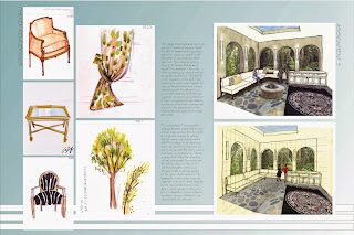
Throughout this semester in interior design 205, visual
communication I have learned many useful skills and have improved with each
technique over the course of the semester. This shows throughout my weekly
homework as well as the various assignments that were to be completed. I was
taught how to effectively render with marker while making progress with
sketching a space with depth and accuracy in scale. My improvements in being
able to effectively communicate a space are shown through my weekly journal
entries. The progress in my marker renderings are shown through my weekly
rendering practice, from not being able to effectively layer colored pencils
and markers to being able to successfully communicate the visual appearance of
an object as realistically as I can. Throughout the duration of the semester we
completed a series of three assignments that were to teach us how to correctly
represent the depth of a given space by using 1 and 2-point grids. By learning
this I eventually became confident enough with my understanding of showing an
area accurately to be able to freehand perspectives, but I still have much to
learn. With each assignment I feel that I improved as I continued to practice
the techniques we were taught in class. I personally enjoyed learning how to
render with colored pencils and markers to give the illusion of a realistic
space. I find this vital information for us to learn because the interior
design we are expected to communicate our ideas in the best way possible. Being
a visual person, as most people in the creative field, this is highly
important. In the words of Confucius, “Learning without thought is labor lost,”
and I am excited to keep learning more and giving everything into my future
work to improve my abilities.

Subscribe to:
Comments (Atom)


